Education Graphics: Patterns in Data
This website
contains substantive information on Texas school test score performance and expenditures,
relationships between donors and recipient members of the State Policy Network,
and details of charter school funding in Texas.
But the main focus is on the use of several methods of interactive
computer graphics to investigate and present that information.
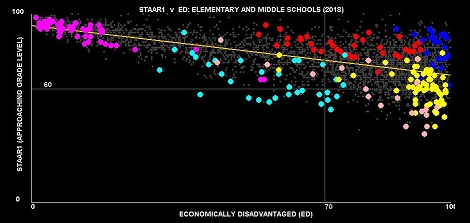
The above
graph is an example of how the techniques used here can provide new and
interesting views of raw data. In this
graph each of the 3,453 faintly visible gray points represents an elementary or
a middle school among 90 of the largest school districts in Texas. Those schools included in six school
districts are highlighted in distinct colors.
The highlighted schools demonstrate that within the overall negative
relationship between academic performance (vertical axis) and percentages of
students who are economically disadvantaged, there are very distinct patterns
within individual districts. This data is made available within the interactive
graphics presentation included in the Big90 Graphs option to the left.
The software
not only highlights individual or sets of schools, but also displays numerical
information corresponding to those which were selected.
A Java
language version of this software is described, and will soon be made available
for downloading. This version, to be run on a desktop or portable computer, not
within a web browser, has more features and capabilities than the web version
available here.
The ten
options available on the select list to the left are briefly described:
Big90
Graphs. When first
selected a brief description of the data being used is presented. More importantly, a link to the interactive
graphics page is presented. Clicking on
this link will present a page with two graphs and a data area beneath
them. Beneath this link, there are three
labels Show steps. Clicking on these results in drop-down step-by-step
instructions that will permit interacting with the graphs presented. Actually,
if the label [AF] is selected (i.e. clicked on using the left-mouse button) an automatic
display of the schools among the 90 included school districts will be
initiated, the districts being randomly selected in groups of five. The process
can be interrupted by clicking on [Clear].
Clicking on [AS] gives a more slowly paced automatic display.
Beneath the
row of select buttons is the link [Examples]. This includes step-by-step
instructions for two more elaborate illustrations.
Clicking on
the link [Instructions] displays a detailed, multi-page set of instructions for
using the software.
The Javascript code used for this page can be packaged with
other data sets. Also, even for the data included in this presentation,
provision is made for a user to create different graphs, using the data
included. The parameters which designate
any such newly created graph can be saved to local storage, retrieved, copied
and pasted to an email, and sent to a colleague to be viewed by him or her on
their own computer when connected to this web page.
Charters
v ISDs. In this
section you can run a program that displays the degree of success of over 8,000
Texas schools in achieving “Meets Grade Level” criteria for their
students. The MGL success data are for
school year 2021-2022. The principal
focus of the displayed data is upon academic success relative to the proportion
of economically disadvantaged students in each school. The individual school data can be displayed
for all the schools in each county or for all the schools in a district, and
the results can be distinguished between
those for charter schools and for schools included in regular school districts.
All of the features described above for the program which displays data for the
largest 90 school districts in Texas are also available here.
ScatterBrain™. This
selection presents a description of an earlier version of the Java-based ScatterBrain program.
Recently several significant new features have been added and the
revised program will be made available for downloading. This page will soon be
updated to permit downloading the current version of ScatterBrain.
It
is pointed out that ScatterBrain does not involve any
coding on the part of the user. It does require that the tab-delimited data set
be structured in a very simple, but specific form, and that each graph to be
displayed be defined—variables to be plotted selected, axes’ scales determined
and labels entered. Data to be displayed
in the data table must also be selected and formats prescribed. From one to
four interlinked graphs can be displayed simultaneously. The descriptions for
an individual presentation, for all graphs and the data table, can then be
saved in a setup file for future use.
ScatterBrain™ Videos. This page provides access to several videos made with ScatterBrain, using a variety of data obtained from the
Texas Education Agency’s website. A set
of data that includes information for most school districts in the U.S is also
used in one video, obtained from the Stanford Center for Education Policy Analysis. These
were my first attempts at creating videos, so they are not very polished, but
they are intended to demonstrate how the program can be used in meaningful
ways.
Charter
Papers. Sometime in
2016 I decided to attempt to resuscitate a Texas school finance simulation
program that was developed nearly 25 years previously. Doing this required
incorporating charter schools into the original program, as charter schools did
not exist in Texas when the program was originally written. In carrying out
this exercise it soon became apparent that the frequent claim by charter school
proponents that charter schools received $1,000 less per student from the state
than was received by regular school districts from both state and local funds
was false. The series of papers and exercises contained in this section
resulted from an attempt to support this realization.
These papers formed
part of the underpinnings of a paper by David S. Knight and myself—"Do
charter schools receive their fair share of funding? school finance equity for
charter and traditional public schools”-- that can be
accessed at the following link: https://epaa.asu.edu/ojs/article/view/4438.
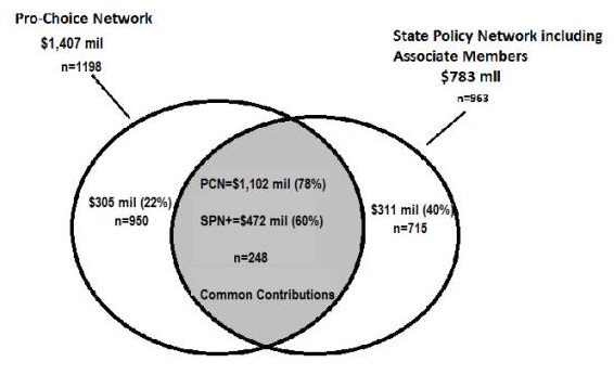
SPN/ALEC.
The State Policy
Network (SPN) and The American Legislative Exchange Council (ALEC), have been
working for decades to redesign and reorient the U.S. economic and political
systems. In short, their goal has been
to reverse progressive gains made during the New Deal era—lower taxes, less
government regulation of the economy, and less autonomy for local
governments. The movement for so-called
choice in public education, while often viewed as a separate movement to reform
U.S. education, has in fact been one of the major goals of the State Policy
Network and its affiliates. The relationship between the two movements can be
demonstrated by observing the overlap in their funding sources. The discussion papers and exhibits in this
section amplify this assertion, which is illustrated in the following diagram.
Common Contributors to Pro-Choice Network and to State Policy Network Gave
$1,102
million to PCN and $472 million to SPN (plus Associate Members)
TCCRI (Texas Conservative Coalition Research
Institute. The very membership makeup of TCCRI’s board of directors seems
designed to arouse interest and curiosity. The board
of directors of TCCRI includes Lt. Gov. Dan Patrick, Railroad Commissioner
Christi Craddick, Texas Comptroller Glen Hegar, 9 state senators and 10 state
representatives. In addition, 13 members of TCCRI’s board are registered
lobbyists, including such powerhouses as Mike Toomey, Lara Keel, and Bill
Oswald. Mr. Oswald represents the interests of Koch Industries in Texas,
and is the registered lobbyist for 9 Koch Industries’ Texas subsidiaries. Tax
returns show that the Charles Koch Foundation contributed $1.8 million to TPPF
in 2018 and another $1.5 million in 2019. In turn, records at the Texas Ethics
Commission indicate that the members of TPPF’s board of directors made campaign
contributions to board members of TCCRI totaling $485,705 during the years
2019-2021. Approximately two-thirds of that amount went to Lt. Gov. Patrick.
See the additional descriptions and summaries below for additional facts about
TCCRI.
Civitas Institute. During the past year a number of articles were written about the
stealth installation at UT Austin of a right-wing institute “dedicated to the
study and teaching of individual liberty, limited government, private
enterprise and free markets.” [Texas Tribune, Kate McGee, 8-26-2021] Originally
dubbed the Liberty Institute, but finally named the Civitas Institute, Lt. Gov.
Dan Patrick raised the possibility that the goals of the new institute might be
more pointedly political. “I will not stand by and let looney Marxist UT
professors poison the minds of young students with Critical Race Theory.”
Patrick wrote on the social media platform Twitter. “We banned it in publicly
funded K-12 and we will ban it in publicly funded higher ed. That’s
why we created the Liberty Institute at UT.” [reported in the Texas Tribune,
McGee 2-16-2022] Two days later the Texas Tribune also
reported “Lt. Gov. Dan Patrick said Friday that he will push to end professor
tenure for all new hires at Texas Public universities and colleges in an effort
to combat faculty members who he says ‘indoctrinate’ students with teachings
about critical race theory.”[McGee 2-18-2022] See the additional description at Civitas Institute
linked to in the side bar.
Texas
Income Tax. Reasons
for taking a new look at the prospects and need for a Texas Income Tax.
Negative Impact of High Poverty Levels on the Academic
Performance of All Texas Students (EDvNED). This version of ScatterBrain (Javascript) has
been modified to display a data set that shows student achievement in 1,019
elementary schools and middle schools in 16 of the larger school districts in
Texas. The emphasis is on demonstrating the impact of poverty upon academic
performance. The sad fact is that 60
percent of Texas’ public-school students are classified as being economically
disadvantaged. Twenty years ago this number was 45 percent. This one-third increase in the number of
Texas school children who are eligible for the federal Free or Reduced-Price
Lunch Program has made it extra difficult to improve their educational
performance. Furthermore, the very high
proportions of economically disadvantaged students in many schools greatly
multiply the difficulties of achieving satisfactory academic progress. In
addition, the concentration of large percentages of economically disadvantaged
children in a given school also reduces the progress of students in that school
who are not designated as economically disadvantaged. The Texas school funding system’s additional
grant provided to school districts for each economically disadvantaged student
fails to meet the greatly increased cost of educating such students in schools
with very high concentrations, nor does it acknowledge the collateral costs
imposed on the non-economically disadvantaged students who attend the same
schools.
Negative
Impact of High Poverty Levels on the Academic Performance of All Texas Students
(EDvNED All Districts)—Version II
Version II
is similar to the version described in the previous section, but Version II
contains data for 775 regular Texas school districts, containing 4,827
elementary and middle schools enrolling some 2.9 million students. Test score results are still for school year
2021-2022, using the percentages of students achieving the Making Grade Level
standard for all subjects and for all grades in the schools.
Again, the
exhibits are designed to emphasize the differences in test results for
economically disadvantaged students and non-economically disadvantaged students
in each school. The displays can be thought-provoking.
One change
made here is the added [Single] button. When this button is clicked on
and changed to red, the two graphs are superimposed. The reason for this feature is to be able to
perform direct comparisons between economically disadvantaged students and
those not disadvantaged in the same schools. Note that Meets Grade Level (MGL) for these
types of students are shown separately.
The LH graph plots ED students on the vertical axis, while the RH graphs
plots non-ed students on the vertical axis. If an individual district is
selected, using the [Hlt/Sel] button and the district
select list, and the [Single] button is selected (turned red) ED and non-ED students
in the same schools are plotted directly above/below one another. If the [G0/1] button is selected (red) and the
[Multi] function turned off (not red) then the mouse can be used to identify
the upper (aqua) point. MGL for both ED and non-ED students in the identified
school will be written to the data window. If it is desired to identify a pair
based on the lower (orange) point the [G0/1] button should be white.
In addition,
because of complications arising with the two graphs being superimposed, the [Mult]
function, identifying multiple or groups of schools, only operated in the RH
graphs when the two graphs are separate ([Single] turned off or white).
Negative
impacts of poverty—ED 0423 and ED 1723.
The next two
options on the left use ED data from two different years simultaneously to be
able to observe the degree to which ED percentages change during the intervals
for all schools and for individual schools for which data were available for
both years. Only non-charter elementary
and middle schools are included in these data sets. For the ED0423 data set
there are 4,281 elementary and middle schools enrolling 2.3 million students; for
ED1723 5,257 such schools with 3 million students.
When either
of these data sets are displayed the RH graph will included a 45-degree line;
schools plotted above this line will have experienced an increase in the percentages
of students qualifying for the FRPL program, those beneath that line a decrease
in the percentages of such students.
Note that if
it is desired to select the schools in an individual district, first click on [Hlt/Sel], turning it on (red), select the desired district
from the district select list. After the schools are selected, turn off the [Hlt/Sel] button. Use
[Multi] (red) to aggregate data for multiple schools, using the mouse feature,
or turn [Mult] off (white) to identify individual schools. Individual schools can also be selected from
the school select list. When an
individual district is selected, the schools in that district are
written to the school select list.
Note that
regression lines can be controlled with the [Regr] button
feature, which pops up a small menu permitting the selection of regression line
options for global (all schools in data set), local (just those schools
currently selected).
Leaving the
global regressions line permits observing where individual schools are relative
to poverty levels for all schools in the state.
The local regression lines illustrate the level and slope of the
characteristics of the schools in an individual district, relative to all
schools.
Larry Toenjes
Clear Lake Shores, TX
ltoenjes@aol.com